Nemala – Visual Identity for a Graphic Design Studio
Minimalism with Meaning, Inspired by the Ant
Nemala — meaning ant in Hebrew — is a creative studio built around the quiet power of detail-oriented design. Like ants, the studio moves with intention, collaboration, and smart systems. The branding reflects those values through a minimalistic yet character-rich visual identity.
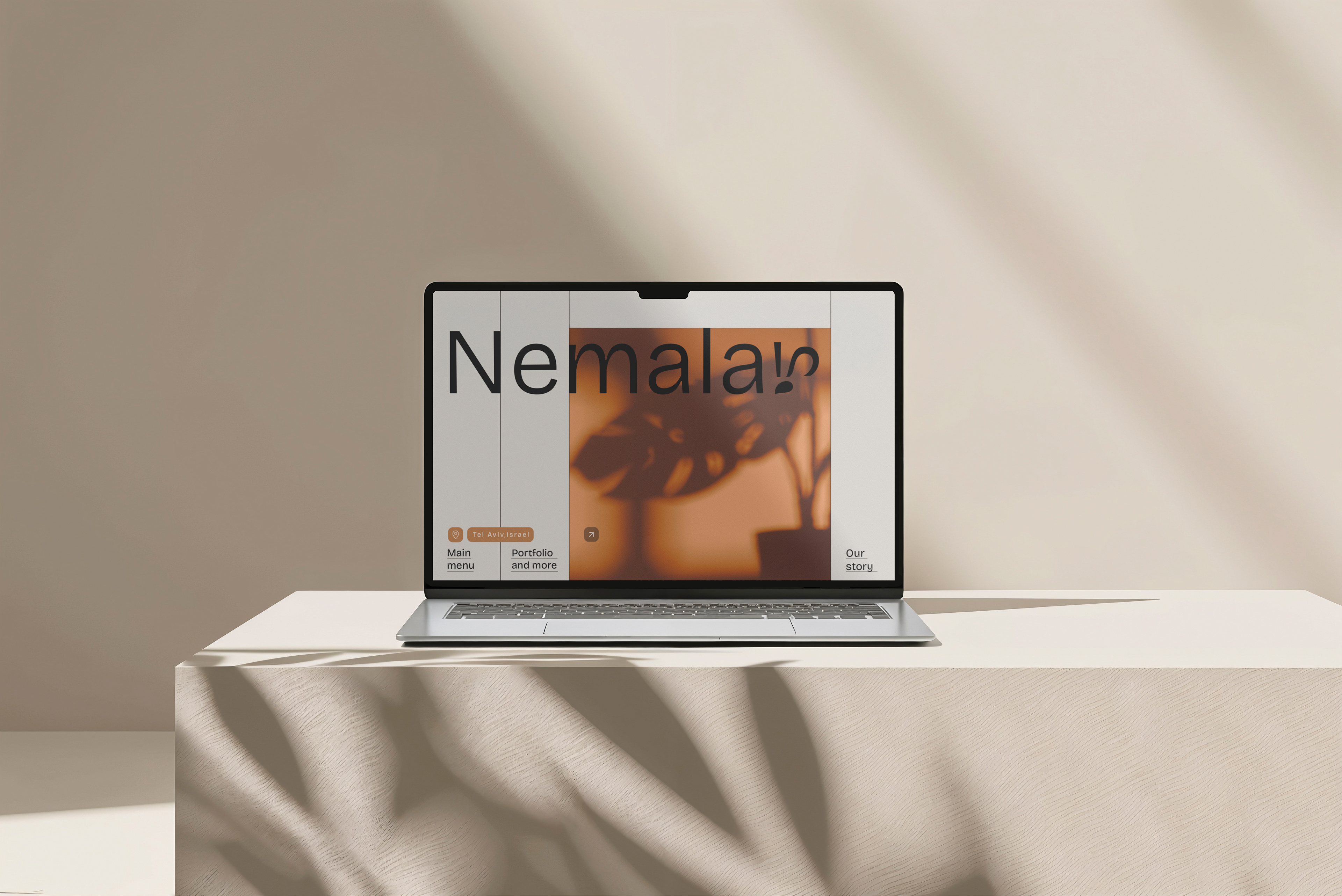
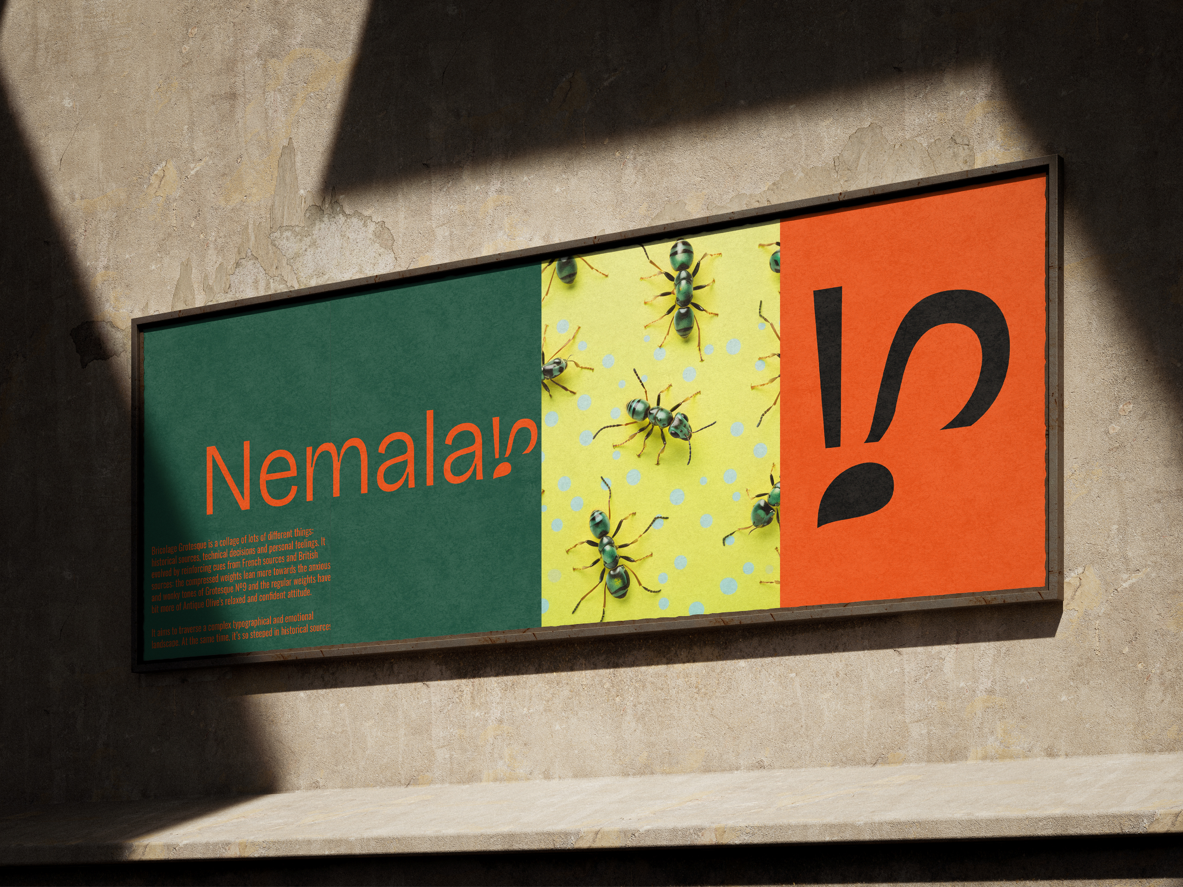
At the core of the system is the Bricolage Grotesque typeface — chosen for its structured yet humanist feel, reflecting the balance between precision and creativity. The color palette was created to make a clean yet dynamic contrast that gives flexibility across print and digital formats.
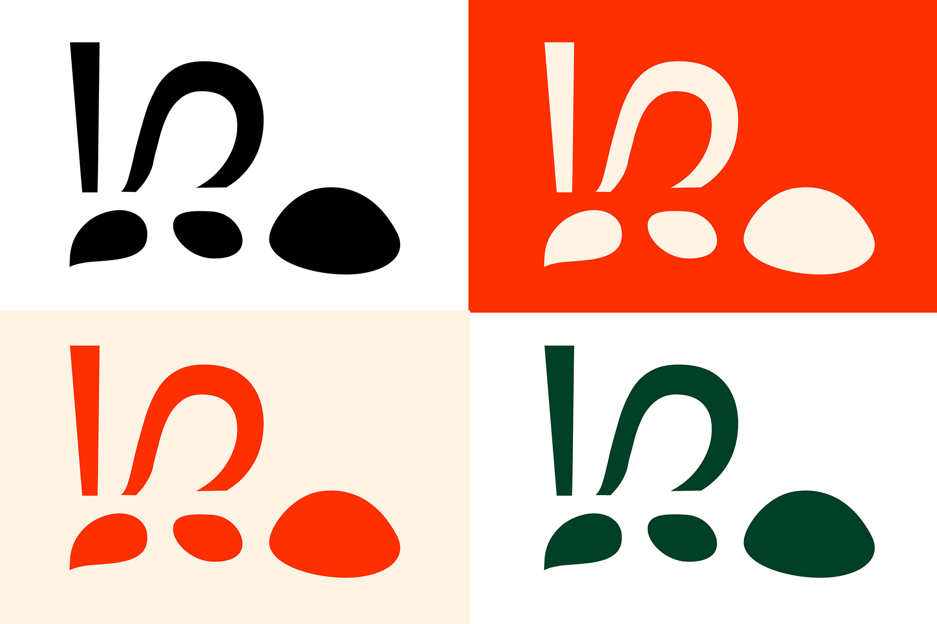
I created a custom icon that subtly echoes the shape and form of an ant — minimalistic and geometric, yet distinct. The logo is elegant and typographic, with a restrained personality that allows the visual system to shine through in collateral and applications.
The result is a brand identity that communicates trust, cleverness, and craft — a small studio with a strong design backbone.